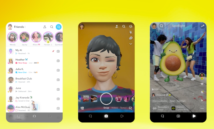
Social media platform Snapchat is introducing a new and simplified interface that digital-first observers believe is an attempt to compete with TikTok and Instagram. One of the key elements of the change is a simplified way for users to watch videos.
Currently, Snapchat is built around five main tabs – but the new look will be reduced to three tabs that organise the app around “communicating with friends, using the camera, and watching Snaps from friends and the broader Snapchat community, including creators and publishers.”
The big shift is the latter, which will see videos from creators and publishers merged into one. “We’ve been working on unifying Stories and Spotlight for some time,” explained the company. “Now, with this new and simplified design, Snapchatters will have a more personal and relevant viewing experience. This update also has the potential to help our creators and publisher partners find new audiences across new surfaces, and support our advertising business over the long-term.”
Drilling down into the new format, Snapchat said it is “powered by our first-ever unified recommendation system that makes for our most personalised experience yet. Videos from friends are prioritised and recommendations are based on what Snapchatters love sharing with their community, what’s trending among their circle, and what they love to watch.”
The new look was announced at Snap’s annual Partner Summit in LA. Speaking to The Verge afterwards, Snap CEO Evan Spiegel said the change would work well for Snap’s creators: “One of the things that creators have done very effectively is use shortform video to grow their Stories audience and then monetise the Stories through our revenue share programme,” he said. “I think that will become even easier with this app layout.”


